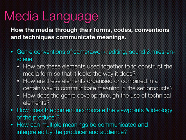
P1: Media Language and Representation
1/11/21.
L/O: to develop the language of media analysis.

Starter task:
What is this?
This is an album cover from Pink called "I'm Not Dead". The main image is a female who is shouting at something, surrounded by roses and white doves. The typography is more masculine with skulls around the text, Also dragons and stars are around the artist.
What is the genre?
This could be a Pop Rock Genre.
Who are the audience?
The target audience are Late Teenagers and Young Adults aged 18-21+.
How is the artist represented?
The main artist is represented in the Album cover as rebellious with loud aggressive look on her face.
4 main theoretical framework:


Denotation: Elements that are unarguable; the factual elements.
When we start any analysis, there are two basic features we can start with.
From this image alone, what do we know?
A man is wearing a hat holding a cigar looking down.
From previous experience, what do we know?
it is an Album cover specifically a old school rap album.
Connotation: Elements that are arguable; elements that are personal to the viewer.
This relies on personal knowledge & experience.


Compare these two media products:
What are the denotative elements?
"born this way" has a female as the main image who is seemed to be transformed into a motorcycle. The motorcycle seems to have blades on the handgrips, big long exhaust. Also the main image, seems to be wearing black clothes with messy hair. "Royalty" has a male who is seemed to be holding a baby this could indicate that the man in the image has a baby. The main image, is wearing no T-shirt and has jewellery which could indicate that the man is rich. The Main Artist is represented as rebellious violent through her makeup, hair, and the bike.
What are the connotative elements?
"Born this way" is a pop rock album cover by Lady Gaga, this could be seemed from the motorcycle; looks more violent / dangerous. Also the artist, seems to be wearing black clothes and messy hair which could indicate that this female is dangerous and violent and this could be proven by the bike and the main artist. The target audience is men aged 20+ who listen to rock, this could be proven by the bike as the bike is more masculine ( black and white ).
"Royalty" is an R&B album cover from Chris Brown, This could be emphasised by the baby in the image, Chris brown is holding the baby with love which could indicate that the focus of the album is the baby. The target audience could be teenagers as Chris Browns music are for teenager girls aged 15+. The image is a medium close-up of Chris brown looking down on the baby which could indicate that the baby is more important than Chris brown himself.
What evidence is there that they are aimed at different audiences?
First of all the typography, For Born this way the typography is more masculine, bold and loud compared to Royalty which has light Slab serif text that could indicate that it is more of a love / sad album cover. Second of all, The choice of image in the two album covers, For Born this way, it has a big dangerous bike that emphasises the album cover as loud, violent compared to Royalty which has the baby as the main focus rather than the artist himself.
04/11/21
Advertising & Marketing
L/O: to explore the conventions in print advertising.

The main image is a eye level medium close up shot.
The colour scheme is red which blends perfectly with the perfume and the background.
The colour scheme is red and black, the colour red has connotation to blood and the colour black has connotation to death. This can be linked to the products name " HYPNOTIC POISON ", Poison has connotation to death linking the the colours used in the poster.
The main image is wearing black dark clothes and white pale skin to make the image stand out from the background.
The lighting is used to illuminate the main image as well as the perfume bottle with light parts illuminated more whereas the dark parks are less illuminated.
Props used in the image are red pressed glass beads and the perfume bottle, the red beads are used to blend the main image with the background and the bottle is the main focus with most of the lighting is on the perfume bottle.
22/11/21
The Logo is centred at the top and bottom of the main image, Fonts are different with the " Dior" at the top, its more large and dark whereas the bottom dior is the main logo with bright colours. The main products name is in the right centre of the main image with light font with bright colours. The main image takes 2/3s of the poster.
The colour scheme is red and black, the colour red has connotation to blood and the colour black has connotation to death. This can be linked to the products name " HYPNOTIC POISON ", Poison has connotation to death linking the the colours used in the poster.
The lower case serif type font that is used is a feminine font which can emphasis that it is a females product, The Upper case san serif type font used in the products name can link to masculine and can also emphasise that the product is scary.

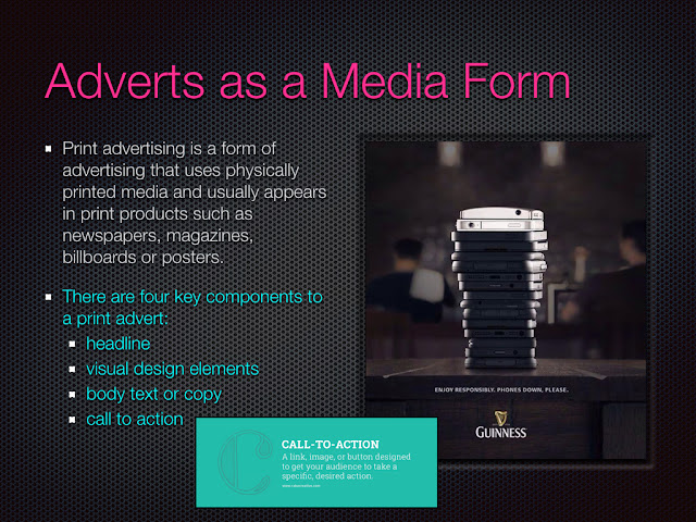
Four components to a print advert:
- headline
- Visual design elements
- body text or copy
- call to action


- Slogan: In the centre beneath the bucket
- Product image: KFC bucket
- Font size: the font is centred with big font size to make it stand out
- Typeface/ Font Style: "it's, good" is light small font . "MOUTH WATERIN'" is bold text with black colour font to make it stand out from the other texts.
- colour palette: red, white and black.
- Composition & Layout: Everything is centred, text, prop is organised in the centre, with the main image being the main focus.


- This poster represents male athletes as dominated and more athletic compared to female who are presented as weak, this can be seemed in the text "One more thing for men to rule". The negative stereotype of females aren't good athletes excluding the female gender from the poster.
- The initial reading is that men are more athletic and would be considered to my opinion as oppositional reading as the initial message of the poster is sexist.
- The poster would represented the dominated group and would agree with the message behind the poster.
- The social group would include working class white males aged 17+ who are athletes.
- The poster is Selective with the gender

Ethnicity


11/11/21
Exam set texts
L.O: To explore set advertising texts and research brands.
Old Spice - "Smell like a man"
Old spice is an American brand of mens grooming product compassing of aftershaves, deodorants and antiperspirants, shampoos, body washes, and soaps and is manufactured by Procter & Gamble. Starting in June 19, 1937, old spice was originally manufactured by Shulton Company, founded in 1934 by William Lightfoot Schultz. Old spice had a rebrand in 2010 and now is a mens grooming brand, during the 70s, old piece was originally a shaving brand and turned into a fragrance brand in 1970s. Old spice's target audience is 12-34 men. The current star vehicle of old spice is Isaiah Amir Mustafa who is an american football player, Mustafa is widely known as the main character in the series of Old Spice television commercials, The Man Your Man Could Smell Like. The audiences are represented to be masculine athlete males as the star vehicle is Isaiah Amir Mustafa who is an american football player and is well known in the sports community, this brings sport community audiences to the product.

 this is a picture of old spice in the 90s
this is the current ad for old spice with Isaiah Amir Mustafa
Lucozade Sport - " i believe"
Lucozade is a British soft drink manufactured and marketed by the Japanese company Suntory, created as "Glucozade" in the UK in 1927 by a Newcastle pharmacist, William Walker Hunter (trading as W. Owen & Son), it was acquired by the British pharmaceutical company Beecham's in 1938 and sold as Lucozade, an energy drink for the sick and Lucozade's target audience is 18 to 30 young men as the brand bids to widen its audience beyond the sports performance market. In 1983, Lucozade had a rebrand to a sports drink and was used for health rather than sickness. The poster uses Gareth Bale as the main focus in the advert Lucozade " I believe ", this can represent the main target audience of the advert which are white male aged 17-30+ , who play football or can be fans of football which brings sport community audiences to the product, expanding the audience to unique variety. Lucozade uses Athletes as the main focus of the product; Lucozade is a sport drink which links to the athletes used to persuade the audience to use the product. The advert had a series of poster having female and Male athletes which attracts different audience to buy the product, the product is not selective with their gender.

This is a picture of Lucozade in 1983, the year lucozade had a rebrand to a sports drink.

The Star vehicle of lucozade was Garth Bale in 2013, Lucozade became a sports drink and promoted there drinks with athletes to fit with there brand, also in 2012 the London olympics happened.
Shelter
Shelter is a charity to stop homelessness and bad housing in great Britain, they provide housing advise and practical assistances and fight for better investment in housing and for laws and policies to improve the lives of homeless and badly housed people. Shelter was first found 1st December 1966 by Bruce Kenrick.
Homework - 14/11/21

Lynx effect advert - Male are presented as dominated in the advert, as the main objective of lynx is to draw male audience to their products. The man in the poster is represented as a dominated male that attracts any women to him, this could be further emphasises by the clicker in the poster, the clickers are usually used in clubs to count how many people are in the nightclub, however, lynx uses this for a different purpose. The clicker in the poster is how many women fell in love with the guy in the poster, basically saying " buy our product and women will fall in love with you". The poster's main target audience could be social group, white males aged and for the reading, the products reading would be dominated reading as they want men to buy the products to attract females, however in my opinion it is oppositional reading. It is oppositional reading because females are represented as weak and easy to manipulate to fall in love.
22.11.21
The Lynx effect brand name can connote that the product is a sex appeal product which links to the products message, " Buy our product and you will get all of the ladies ", females are treated like objects in this poster as they are represented to be sex appeal for males.
The blue colour palette in the background can connote masculine and links to the products audience which as male aged 17-30+, this can also mean that the product is selective with the gender only having male audience.
The "click" Fragrance text can link to the the clicker the model is holding, further emphasising the product and the meaning behind it. The San serif blocky upper case font can link to masculine, the products audience are males as the main model is a male.
The main image is a medium close up shot, the model takes 2/3 of the poster and the model has a known fascial expression. the nerdy looking male looks rather pleased with himself as he is holding a clicker with the number 1930, this can emphasise how many women fell in love with the nerd.
Coco Cola advert - The adverts main message is that the people who produce don't make coco cola better but the audience and people who buy them. The man in the photo is Elvis Presley and what the poster could be talking about is the sugar tax in the UK and the idea was to reduce the sugars in popular soft drinks in the UK. The message could be talking about how the classic sugary coco cola drinks are better than no sugar drinks. The product is represented to be against the idea of reduce sugar tax and is telling fans that over 100 years the recipe of the drink stayed the same and will stay forever. The advert could be going against the dominated group, going against the law. The adverts audiences could be both male and female as the poster had a serious of posters, one poster having Elvis Presley the other having Marilyn Monroe, However, this could be targeted for older audience 30+ as they used old music artist to draw attentions to the advert. The initial reading is dominated reading, this means that the advert wants the audience to agree with the meaning and buy the product which I agree with the meaning.
Sexual assault charity in the UK - The 3rd poster is a an awareness for Sexual assault in the UK, the poster says "It's none of my business", which is basically saying that people who haven't experienced sexual assault is not there business, This is an Oppositional reading in my opinion, because even though it is not a product, sexual assaults is everyone's business as it could affect someone in the future. The message could indicate that when it comes to talking against sexual assault or domestic violence everyone is ignoring instead of talking about it, The poster is telling how people need to start talking about it before its too late. The man in the poster could indicate how male are the reason to high cases of sexual assault, this could link to the dominated group, males aged 30+ could be the cause of it. As of my opinion, this is both right and false, as though males are the main cause of sexual assault, females are also the cause of it, The poster has a series with males and females on the poster, the message also could be that females and males both experience sexual assault, the awareness is not selective with gender.
22.11.21
The Hestia awareness charity poster uses celebrities to appeal audience to the act, The medium close up shot the male in the poster is Andy Serkis who is a English actor who is known to be a serious actor. Andy in the poster is looking intense which can emphasise seriousness regarding the awareness, with a slight head tilt which can link to andy questioning the audience as he directly addresses the awareness to the audience. This can also represent White males aged 30+ in the UK as they could be the problem to domestic violence, Most of domestic violence is from males in the UK and Hestia uses Andy Serkis to represent the males who cause domestic violence. Hesita is asking the audience to question their own stance on not discussing violence in UK and persuade the audience to stand up for violence.
The three poster have a target audience for different products/ campaign, the male grooming products have specifically male audience, the coca cola has both female and male audience as well as the campaign. The message and the meaning behind the posters are different as well, the male grooming products agrees with the dominated groups and is selective with the gender, the coca cola is the opposite as they disagree with the sugar tax law and is going against the dominated group as well as the campaign.
15/11/21
Applying Semiotics
L/O: to apply semiotics theories when creating media products


In the beginning, Lucozade was a medicine drink and was sold in chemist shops, Lucozade was a drink to provide energy to people such as household wives and children. During the 1980s, Lucozade advertised their drink using Daley Thompson "Dasley Can", The product was made in a can and targeted teenagers and young adults, this meant that the audience would suddenly changed from household wives and ill people to teenagers. The drink was marketed to help ill people by providing energy for them and was meant to be used for weak and ill people. In the 1990s, Lucozade brand diversified with the launch of Lucozade sports, and had a complete different marketing, today Lucozade is a sports drink that provides energy for teenagers and younger adults. Also in the 1990s, Lucozade was advertised in the video game Tomb Raider, The main character Lara croft was used to market the drink in the video game industry, the drink was called "larazade". In the 2013, Lucozade would use athletes to market their drink to other audiences, Today Lucozade is the Number 1 Sports drink in the UK.

The San serif Condensed font could indicate that the audience is male as usually San serif fonts are used to represent masculine.
The layout of the advert has the model on the right for the text" IN A DIFFERENT LEAGUE" to fit on the left, The advert is organised and it looks professional, The advert is also spacious not having all the main concept of the advert to be clumped together.
The colour palette consists of Blue, Yellow and White, this matches the products palette, blue could symbolise male as blue is more masculine, this could indicate that the sport drink is targeted for males.
The shot of Gareth Bale is a medium eye-level close up this could be emphasise the use of direct address as Gareth Bale is looking at the audience, this could be a marketing strategy to persuade the audience to buy the product and the model takes 2/3 of the advert.
The costume and make up used in the advert is a football kit which matches the model as Gareth Bale is Professional football that is globally known for his unique skills used in his matches but he is well known in the UK which matches the lucozade's regional audience which is England. The use of make -up is used to highlight his facial expression, Gareth Bale is looking intense which could indicate seriousness and could also emphasise the fact that the message of the advert is true and proven.
The register of the advert is formal and serious this could be proven from the main text " IN THE DIFFERENT LEAGUE", this could be a marketing strategy to emphasis the fact that Gareth Bale is in a different league after using the product, Also at the bottom right next to the product it says " SCIENTIFICALLY PROVEN ", this could be linked to the products message "Hydrates and fuels better than water ", the point of the message was to make a drink that provide more energy than water however, scientist discovered that the message was false and the Advert was banned as it was misleading information.
Unfinished phrases or claims could be linked to the text next to the drink " Scientifically proven ", the advert does not use statistic to proven the message so the message could not be proven and could be linked to unfinished claims.
The advert uses a celebrity which links to the product, Gareth Bale is a celebrity endorsement and is used to persuade the audience to use the product.
The advert could represent males athletes as " in a different league ", the lucozade advert persuades their audiences to buy their products. The Events represented is football as Gareth Bale is one of the best known football player in the world, this persuades the football community to buy Lucozade products. The issues represented could link to health as the old Lucozade would help with health and provide energy to the ill people. The social group in the advert is white males and the individual is Gareth bale. The combination could be that white males are successful in the sport community.
The choices of the blue colour palettes symbolises that the advert targets male audiences.
positive stereotype could be that white men are reinforced, arguably repeating ideological values of patriarchy. Done through the use of colour palette and the celebrity used this could indicate that lucozades target audience is Males, this could also mean that the advert is selective with the genders.
Under representation of other social groups serves to naturalise their lack of social power/ presence.
The advert uses patriarchal ideology to stereotype males in the sport community, The use of a white athlete could indicate that white athletes are more successful compared to other social groups and use of a male athlete rather than a female could also indicate that males are more successful than females, this can be linked to the dominated group as most of the media is under control by the dominated group, this can be linked to the lack use of black people as well as females in the advert as the dominated groups messages is that males are more superior to females.
02.12.21
Analysis and context for old spice advert
Task 1:
During the 1960s, Old spice was marketed to attract females when using the product, the unrealism statement persuaded males to buy the products. the product consisted of 2 elements, 1 being manly super studs, this meant the hairier the better and 2 was the fact that women who cant resist them. the brand was represented as a pheromone, propelling women to involuntarily throw themselves. This can be linked to the rule in 1960s, when women had no rights this let to men treating women like objects, we can see this in the advert of Joan Daly were it said " Girls like it, is there a better reason to wear Old spice ", and further more in the 1970s, the advert of a women naked wearing limited clothes it said in the poster " Two good reason for rise ", women were objected sexual when it came to the advert. The message of advert was " wear our product and women will not resist you ". The marketing technique had been going for decades when in 2010, when Old spice was rebranded this was difficult for the brand to implement different message after decades of having the same message. Old Spice introduced a campaign seeking a fresh brand image, this lead to Old spice having the most successful campaign in advertising history, reinventing and sustaining the branding using different promotional media strategies this being Tv, social media and printed and online. Today Old spice is a mens grooming brand that persuades males to buy their product to look masculine, the old message sustained after decades but was changed a bit from sexualising females to "buy our product to look masculine."

- The humorous mode of address connotes that old spice, and anyone who ears it, is young and fun. It also connotes intelligence by being self-mocking, making it postmodern and culturally relevant.
- The anchoring of the image, text and products connotes that old spice is exotic, fun and humorous. if you buy or wear this product, then you are too and could also be as attractive , manly and funny as Mustafa.
- The colour choices reflect the tropical Caribbean and spice islands theme, suggesting that if worn, they too can be transported to paradise! The blue and sand colours help reinforce this while the white font and red product provide a contrast and so stand out.
- A mid-shot of Mustafa is used so he is recognisable. This creates a personal connection and closeness. A long shot of the two deodorant products will aid recognition when purchased.
- Two font styles and sizes have been used: the large, cursive font is the name of the product and part of the branding, with the cursive script personalising the meaning as personal, friendly and real; the smaller capitalised sans serif font for the unfinished claims gives impact and ads humour.
06.12.21
Representation
L.O: TO analyse representation and Ideologies in the Old Spice advert.


Mens grooming product


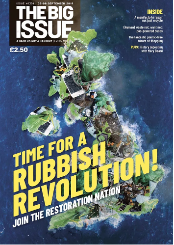
The big issues has a labour ideologies with focusing on issues and having a more of a environmental idea rather than social. This means that Big issue would focus on issues and help others rather than having a social idea and focus on small portion of people. The Big issue talks about different issues and provides help to people who are struggling with poverty and other issues, This is a complete different point of view to a conservative who would ignore the idea and focus on the pop culture. For example, The Sun is a pop culture newspaper that focuses on trends and not issues, this means that they would talk about celebrities, recent event and rarely talk about the local and global issues such as poverty, global change and inequality. However, the media is controlled by conservative rich white males who would ignore local and global issues, that being said Big Issue breaks the traditional view and provides help to others.
Monday 17th January 2022
Cover Analysis
L/O: To analyse Big Issue covers effectively


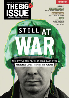
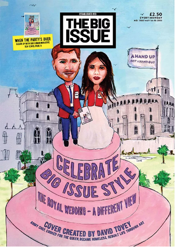
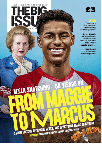
The Big issue uses slightly different conventions in this magazine to stick with the serious tone as well as the issue. The main focus of this magazine cover is Homeless veterans who fought and serviced in war to provide peace to the country. The main image is also a photograph of what could be an ex military veteran who is now homeless after returning back from war. The main cover line "Still at war" could link to how soldiers fight for the freedom but after fighting for years they are still in war with other issue, as the main focus of war is to provide peace for the country and with other serious issues such as homeless, inequality we as people are still in war with those issues. The Layout of the cover is different to other magazine cover Big Issue produces this being said we see : The main cover line and the feature article is in the middle of the image covering the face, this is also creativity constructed as the bottom text on the image cover is covering the eyes which could link to how They would cover peoples eyes when they died in documentaries and other war films. The logo is in the top left cover and is also really big compared to the other magazines, this could address the audiences to War being the big Issue. The representations could be that People die for the country's freedom, peace and freedom, this could link to how many soldiers sacrifices their beliefs, freedom and much more to provide peace for the country. One of the social context could be how some of the soldiers experience Ptsd and how they suffered back at home after experienced horrible things in war .
Thursday 20 January 2022
Constructing meaning
L/O: To analyse the use of intertextuality and multiple meaning

Some of intertextuality and the meaning behind it:
1. The 2016 Remake of Ghostbusters with female actors links to the main central image of 4 Celebrity females who used their voice through Sporting achievements and political beliefs to express their beliefs. The 4 females in the Magazine is considered as the hero's, they used their beliefs to express their negative views on trump and his actions.
2. The Slimer Ghost or " onionhead" ghost is one of the main ghosts in the ghostbuster franchises, the ghost is also referred as " the mean green ghost ". This ghost is remade into a trump face, also referring to the evil ideas and political beliefs Trump had. As the Big Issue magazine is a labour political magazine, they would use trump as the villain in their magazine cover as trump had the opposite beliefs. The use of Trump as the slimer, could refer to the use of the 4 females who had personal encounter with trump they were all negative, they also had negative beliefs of trump.
3. The main cover line of the Magazine is the Phrase " Who you gonna call ", this phrase is used throughout the ghostbuster franchised especially as it is the main soundtrack of Ghostbuster and is used in all of the Ghostbuster films and shows. "The New Female Frontline" refers to the 2016 remake of Ghostbuster which came out 11th July 2016, the recent made Ghostbuster was a flop. the phrase could link to 2 different ideas, 1 being the negative beliefs of trump and the 2 being the general sexism and inequality in the movie community.
Representation
L/O: To analyse the representations and ideologies constructed
Ideology: An ideology is a set of beliefs, especially the political beliefs on which people, parties, or countries base their actions.

Satire : " he use of humour, irony, exaggeration, or ridicule to expose and criticise people's stupidity or vices, particularly in the context of contemporary politics and other topical issues. "

MUSIC VIDEOS
Monday 24th January 2022
Music Videos
L/O: to research selected case studies for use of Media Language & Representation
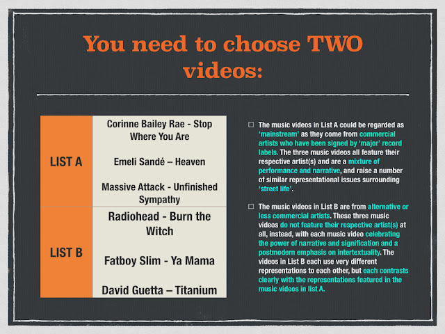
List A:
Emeli Sandé - Heaven
Genre: Pop
Release date: 14 August 2011
Lyrics:
Will you recognize me
I try to keep my heart beat
But I can't get it right
When I'm lying on my back?
Somethings gone inside me
And I can't get it back
I wake with good intentions
But the day, it always lasts too long
Then I'm gone
Oh heaven, oh heaven
I wake with good intentions
But the day, it always lasts too long
Then I'm gone
Then I'm gone
Then I'm gone
Then I'm gone
Then I'm gone
Then I'm gone
When I'm stealing from a car
You're not gonna like me
I'm nothing like before
When I lose another friend
Will you learn to leave me
Or give me one more try again
I wake with good intentions
But the day, it always lasts too long
Then I'm gone
Oh heaven, oh heaven
I wake with good intentions
But the day, it always lasts too long
Then I'm gone
Then I'm gone
Then I'm gone
Then I'm gone
Then I'm gone
Then I'm gone
I wait with good intentions
I wait with good intentions
I wait with good intentions
I try but always break
'Cause the day always lasts too long
Then I'm gone
Then I'm gone
Then I'm gone
Then I'm gone
Then I'm gone
Then I'm gone
Then I'm gone
Then I'm gone
Then I'm gone
Then I'm gone
Then I'm gone
List B:
David Guetta - Titanium ft Sia
Genre: Pop
Release date: 21 December 2011
Lyrics:
But I can't hear a word you say
I'm talking loud, not saying much
I'm criticized, but all your bullets ricochet
Shoot me down, but I get up
Fire away, fire away
Ricochet, you take your aim
Fire away, fire away
I am titanium
You shoot me down, but I won't fall
I am titanium
But it's you who'll have further to fall
Ghost town and haunted love
Raise your voice
Sticks and stones may break my bones
Talking loud, not saying much
Fire away, fire away
Ricochet, you take your aim
Fire away, fire away
I am titanium
You shoot me down, but I won't fall
I am titanium
I am titanium
I am titanium
Firing at the ones who run
Stone-hard as bulletproof glass
I am titanium
You shoot me down, but I won't fall
I am titanium
I am titanium
You shoot me down, but I won't fall
I am titanium
Summary of the song: The song links to the inner strength every person has, the Power is emphasised in the music video but the message of the song is influenced by people who was bullied. The music video has a positive message towards people who got bullied mainly expressing them to Stand up. The use of the word "Titanium", could link to the strong hearted and strong will.
Thursday 27 January 2022
Music Videos
L/O: to explore the purpose, form and conventions of music videos

Rock
Camera:
Close-ups of the artist helps to show emotion as well as facial expression
Medium close-up helps to could also link to the use of Close-ups and to show emotions
Rap
Camera:
Long shot helps to show settings as well as the model in it, used a lot in Hip-Hop music videos to show setting
Medium close-up helps to show emotion as well as the models clothes and much more, they are used to show the model and their facial expression

Monday 31 January 2022
Music Videos
L/O: to explore the conventions, contexts and representations in case study videos
Emeli Sande - Heaven
Camera work:
Mid-shots and close up of the artist help to personalise them and show their emotions
The use of different angles shots help to keep the listener more engaged to the music video
Editing:
Edits and cutting is used in the music video to follow the tempo of the song; keeps the clips up to beat, this is used to naturally keep the video smooth with clips linking to the current lyrics.
The use of bright colour grading shows the positive tone the song is trying to create through the use of lyrics and the songs message, The consistence of clean transitions also keep the video smooth and naturally transfer to different clips through quick but clean transitions.
Mise-en-scene:
The music video uses different locations to create realism to the music video as well as show tone and match the narrative of the song
The use of street costume and make-up could indicate the location and to show realism to the music video as well as the genre of the music video and also it could be used to show the colour scheme or the tone of the music video.
David Guetta - Titanium
Camera work:
The music video continuously uses Mid-shots and close up to show the emotion of the artist
The Use of different camera angle shots keeps the video more engaging to the listener as well as show setting, artist and much more through different perspectives.
The music video uses tracking camera movement to track the model, artist throughout the video through different settings
Editing:
editing techniques such as transitions and cutting help the video keep up with the tempo with the music - for Titanium the tempo is much bigger so the transitions will be much quicker compared to a smaller tempo. This is used to keep the editing up to beat with the music.
The less colour grading helps to show tone and the genre of the music video - For Titanium the genre of the music video is Pop so the colour palette will match the genre as well as showing the tone of the music video, Titanium could represent a much sad yet tense tone in the music video.
Mise-en-scene:
The variety of different locations help to create realism as well as setting a tone to the music video, Titanium would use much abandoned setting to link with the lyrics and the model in the music video.
Titanium would use street clothing to match the tone of the music video as well as link to the setting used in the music video, it creates realism in the music video when using costumes that links with the setting.


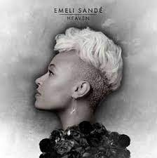
Emeli Sande is represented similarly through different advertisement such as Album/ single covers, Wallpapers, magazine covers, Merch etc, she is represented to be strong and independent in her advertisement.
Throughout the adverts, the use of low angle close-up of the artist in the advertisement is used to show power as the audiences are looking up at the artist as if she is like a goddess and she is powerful, she is represented to be independent and powerful throughout the different advertisement.
Emeli's fashion style and her hairstyle could be linked to the current generation as she is presenting her views and beliefs to the younger, current generation, also it could be linking to her genre as most of her songs are drum and bass or pop linking to the current culture.
The use of black and white colour scheme could show realism and the tone she is setting in her music videos, which could be sadness and defeat.
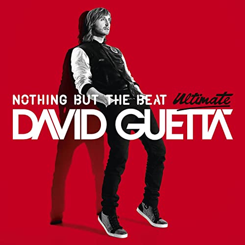


The use of eye level or low angle Medium shots of David Guetta could be linked to his popularity and his fame, power etc, his posture is more tense which could link to his music and could possible link to his audience being males.
His Costume could link to his genre of music as it could be Pop or the early electronic music which during 2011 is when electronic music was becoming popular, His costume links to his tone in music which is more tense and The current fashion trends linking to the current generation; His target audiences could be younger male audiences.

Homework
Titanium
The release of titanium was in 2011, The previous events that occurred such as the rising of School shooting, the Song titanium could be influenced to make awareness on School shooting as well as bulling.
Heaven
During 2011, UK had numerous of events with one of them being the riot in London, The London riot was protesting the death of a 29 year old Mark Duggan who was shot dead by a police officer, this caused a riot in London. Linking to the event, the song heaven could link to the events as it talks about how the world is evil, and how people need to stop fighting and get together.
Thursday 3rd February 2022
Music Videos
L/O: to explore the use of media language and representations in case study videos
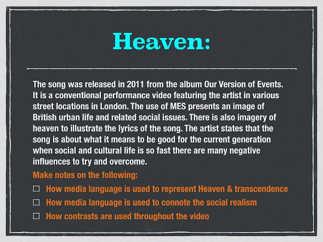


Heaven uses media language to connote the music lyrics as well as the social realism, the use of camera shots as well as Mise-En-Scene to link to the idea of social realism and the street life in UK. Some of the media language could be the use of Camera shots, one of the examples could be the low angle shot of The artist looking up at the sky, This could link to the religious context behind the music video as well as the lyrics as the title of the music video is called Heaven. The medium shot of the homeless man could link to the social realism and how most of the streets is dull and poor, this creates a realism in how the streets in UK is the opposite of what someone who lives somewhere else believes. The use of a homeless man could show the true side in living in the streets and how difficult it is to live in poor areas. The lyrics as well as the camera shots could represent the negative side of living in the streets and how the poor areas influence the people to do bad things, this could link to the fact that in UK, most of the crime is happening in the poorer areas, and Heaven is a song that influence the people in poor areas to do the right things. The lyrics behind the music video, could be a positive spread to people who were influenced by bad people or someone who lives in the poor areas to believe. The religious context behind the lyrics could be the influence that helped her to avoid horrible decisions in life. The contrasts that occur during the video could be the duality between the good and the bad side in the streets, as the video shows that through visuals and media language The video could show the bad side of the area but the lyrics could have a positive side, this creates the contrasts between the music video and the lyrics. The link between the lyrics and the music video could construct an easy narrative to present the realistic idea of street life as well as the good and the bad side of life. Some of the shots such as the close-up of the lighter could link to the idea of drug usage as well as violence, The narrative links to the idea that some people overcome the bad decisions in life from asking for forgiveness from god whereas others follow the bad decision . The contrast between good and bad decision could also be linking to either going to hell or heaven, The use of the street setting could also emphasis the idea that most of the crimes happen in the streets, this links to the idea of bad people influencing innocent to commit crimes the seeking for forgiveness could relate to the realistic ideas of people in similar situations.
intertextuality
Heaven:
Heaven throughout the video reference to different texts mainly through imagery as a way to represent religion, The lyrics as well as the music video links to the intertextuality of Religion specifically Christianity. The name of the song is called "Heaven", linking to the intertextuality of heaven, as well as this we see different references to religion ( Angel wings tattooed on peoples back, a cross necklace ), this idea of Religions could link to the message behind the music.
Oh heaven, oh heaven
I wait with good intentions
I wait with good intentions
I wait with good intentions
Titanium Intertextuality


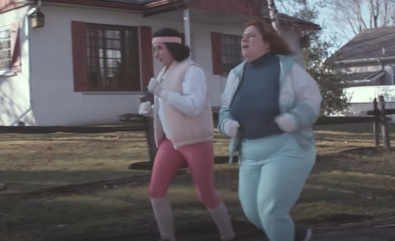

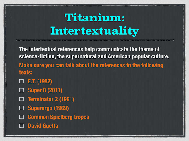
E.T - The references to E.T could be the abandoned feeling the main character in titanium, Child felt alone linking to E.T as he was alone and lost.
Super 8 - Supernatural powers, direct link to the movie
Terminator 2 - the name of the song could link to the material of T-600 which was titanium
Monday 14th February 2022
Titanium - David Guetta
Media Language - 1980s American Suburbia
- The Costumes used in the music video, such as the kid, the two runners, police officers could be a link to the 1980s life in the Suburbia as it has a nostalgic feeling.
- The use of dark/natural lighting could link to 1980s Tv as most of the Tv shows and Films in 1980s weren't properly edited
Editing and Camerawork
- Tracking, close-ups, low angles, eye level
- Fast and slow transitions could link to the beat, as during the beat drop we see that the pace as well as the transitions has increased whereas when the music video has a less intense beat, the video has slow pace and transitions.
- Lens flares
- Slow and fast motion
Narrative
some of the Enigma's:
- What happened in the beginning of the music video ?
- The main character has superpowers
- Does he pose as a threat ?
- Where are his parents ?
The main character is presented as weak and powerless at the beginning of the video whereas at the end we see he is powerful and confident linking to resilience.
L/O: to explore viewpoints & ideologies and audience response to music video case studies

The viewpoints of Emeli Sande
some of the viewpoints of Heaven could be the desire to be better, possibly religious; poverty; hedonism; feminism; individualism are the main points in the music video. The desire to be better could be influenced in the context of the music video as the main message of the music video is to be a good person and the influence of negative people effecting society and the people around them. One of the music videos beliefs is that people in poor areas are influenced by bad people to commit crimes resulting in a negative life, the music video does the opposite and it talks about how people can overcome these negative crimes and become a better person. This viewpoint could also link to another belief as it talks about religion as it uses religious intertextuality, This can be seen in the music video through different ways such as: Lyrics, Title, Wing tattoos, cross imagery.
The viewpoints of David Guetta
Some of the viewpoints that David Guetta address in Titanium is Patriarchy and Individualism and this helps to address social and cultural contexts in real life. The main message in Titanium is self love, bullying, confidence and much more ; this could link to the idea of Individualism as it present social contexts. The imagery of Titanium could also link to the high spike in School shooting, as During 2011, it had the most school shooting recored in America. Through the use of imagery and Lyrics, Titanium helps to spread an awareness to these issues as in the music industry, Issues such as bullying, self love and Social context and events are mentioned to spread awareness to issues. Another viewpoint in Titanium is Patriarchy, this mainly links to the fact that media is controlled by patriarchies as they believe that the male gender is more superior whereas The females are represented to be weak and powerless. However, in Titanium this could link to the opposite of a patriarchy idea as David Guetta believes that there is no superior gender. This viewpoint could link to the lyrics as the main artist singing is a female pop artist 'Sia', The lyrics " you shoot me down, but i won't fall ", linking to the idea of women disagreeing with the idea.
Thursday 17th February 2022
Baudrillard's theory of hyperreality
Baudrillard's theory links to the idea of hyperreality and how the artificial products in media is close to the reality of the real world, but through the use of artificial product it produce a different viewpoint of the real world. One example, could be the supernatural superpower as in the music video the main protagonist uses superpowers.
Trademark Spielberg tropes
ordinary boy hero
American suburban setting
use of enigma/resolution narrative structure
theme of loneliness
use of special effects to create a climax
Emelie sande - How does it celebrate street life?
Class, age, ethnicity, gender
Temptation
David Guetta
Ethnicity
Class,age, gender
Resilience
Dirt
L/O: To review end of unit assessment & set personal targets
Question 5:
Refer to one Music video
Structure:
Why are stereotypes used in music videos - 2 - 3 Sentences.
Introduce your music video and how it uses stereotypes - 2 sentences.
3 or 4 stereotypes examples and context - 3 or 4 paragraphs.
WHAT I NEED TO DO:
revise my music video to understand the overall message and meaning in music video
Revise my context and media language in music videos


Question 6:
Multiple meanings and contextual points
make conclusions on how effective uses media language to communicate multiple meanings.
Cover:

Conclusion :

WHAT I NEED TO DO:
Makes points on the cover and the meaning, use media language to help with responding to examples and talk about how effective
Revise my Big issue context as well as revise media language used in cover to show meaning.
Friday 03 February 2023
Advertising Set Products Unseen comparison
L/O: to revise the set advertising products and look at unseen comparisons.
Shelter revision:
Social realism - identifiable and recognisable representations.
Red upper case san serif bold text connotes urgency
triptych - 3 panels of seriousness
Gender diversity - links to realism
multiple perspectives on homelessness
Close-ups can relate to mug shots - represented as criminal but can also show facial expression
audience identification with ordinary people in distress
2008 bank crisis - economy shrank considerably at 2010 end leading to austerity for more people than previous years.
Use of a website link in posters advised audiences to online advice pages
Old Spice:
Saturated colour palette and high lighting creates an upbeat mode of address and has connotations of the West Indies/Bahamas anchored by sunny day and palm trees
direct gaze to the potential female consumer, body language and mouth movement make a considered sexual challenge.
exotic and mythical connotations
product placement to the right of the frame in the foreground ensures audiences see the brand
reinforcements of male stereotypes
Western ideas of tropical Bahamas
traditional stereotypes of gender roles
Historical American brand 1937 manufactured by multinational conglomerates Proctor and Gamble
Humour and sex appeal on levels of aspiration to target consumers - but also mocks traditional men grooming products
107% increase in sales = commercially successful campaign
Lucozade:
Scientifically proven
Direct address - front gaze
Connotations of masculinity
imperative command strapline - "I believe"
Timing crucial
Wednesday 8 February 2023
The big issue
L/O: to revisit & Revise ML&R set texts
Change in business model:
Went from face to face interaction to social media interactions post Covid which affected the circulation figures.
Founded by John Bird and Gordon Roddick.
Funded by The Big Issue Foundation, edited by professional journalists.
Wednesday 17 May 2023
Music Video
1. presents the social realism of living in the streets, focusing on religion, regrets, childhood, redemption, temptation binary opposition, transcendences, fear
context - living crisis, riots
2. through the use of different people who are affected by the street life, transedcent, still in streets
3. Sande is represented throughout the music video, as someone who experienced such events mentioned in the music video
4. ethnicity - shots used in the music video shows a number of different ethnicity, race
class - homeless, urban street
street life - location
religion - use of religious intertextuality - wings, cross, sky
1. minority, religious, represented through people in the music video
2. singular shots, shots of extreme lighting, shown as having a higher yet same status, real people used
3. harsh reality in street - violence, drugs - shots of lighter
4. London based location, non actors, different class, ethnicity
Titanium
1. individualism, self love, bullying,
2. kid alone, underdog
3. self love, spreading awareness
4. super 8, Steven Speliberg
BIG ISSUE NATIONAL IMPORTANCE


MEDIA LANGUAGE:
ReplyDeleteSome great notes.
WWW: you clearly understand the differences between denotation and connotation
EBI: try to use the terminology of connotations and connotes
JAMES BOND ANALYSIS:
Excellent first analysis! Well done.
WWW: You've clearly answered the question and linked your analysis to the genre and the target audience appeals
EBI: try to include the terminology connotes/connotations and add more detail to the individual poster analysis
REPRESENTATION:
ReplyDeleteGood notes
ADVERT ANALYSIS HW:
WWW: you've clearly understood the meanings behind the three ads and identified some key differences
EBI: you include the terminology that we looked at in the lesson - technical codes & persuasive techniques
SET TEXT RESEARCH:
Good notes so far
LOGO DESIGN:
Love the fashion brand. Like the idea behind the TV brand but not sure about the background colour.
SET TEXT ANALYSIS:
ReplyDeleteOverall, a good analysis of all three adverts including media language, representation and context. Good use of terminology.
LUCOZADE: solid understanding and analysis
OLD SPICE: good analysis but don't forget that part of this whole campaign is the fact that they aimed it at women!
SHELTER: strong understanding of the differences between commercial and charity adverts
UNSEEN ADVERT ANALYSIS (HW):
ReplyDeleteMissing??
BIG ISSUE NOTES:
Good
BIG ISSUE ANALYSIS:
WWW: you've identified and explained many of the viewpoints and contexts
EBI: link these to the target audience and their ideologies
BIG ISSUE (Ghostbusters) ANALYSIS x2:
ReplyDeleteSome good points made about intertextuality but you need to put it all together to come to an overall analysis. Second one is missing.
MUSIC VIDEO NOTES:
Strong and thorough notes with accurate terminology
STREET LIFE EXAM Q:
WWW: you mention the social realism aspects and specific uses of media language to convey street life.
EBI: you answer the question and don't feel like you have to include everything that you know about the music video and it's context!
IDEOLOGY NOTES:
ReplyDeleteGood notes which show a solid understanding of your chosen videos
EXAM STYLE Q:
Missing??